Corporate
Visual Identity
We are all Fairown’s brand ambassadors.
Our brand is much more than a logo on a website. We represent our brand in our communication, photos, graphics, and visuals. These elements help us explain what we stand for and when we all use them, we create a unified and strong brand. Strong brands are key in customer and partner relations, better recognised and trusted by the public.
This site gives you the tools you need to help build Fairown’s brand. This way we know what it should look like and have clear guidelines to make sure we get it right.
Table of Contents
Our logo is the focal point of Fairown - a distinctive and clear symbol of our brand. It is made of two parts - the icon and the wordmark.
We respect our logo whenever we use it. If you're using Fairown’s logo, always follow the guidelines below to make sure it looks the best.
Guidelines for using our logo:
- primary logo on white and light backgrounds;
- secondary logo on colourful backgrounds, preferrably on Fairown's colour palette (dark blue and teal);
- tertiary logo on monochrome or multicoloured backgrounds when use of colours is not possible.
Right version
Don't Use
Right version
Don't Use
Right version
Don't Use
Right version
Don't Use
Right version
Don't Use

Right version

Don't Use

Right version

Don't Use
You can use the alternative logo version in special cases. When using this version, follow the same colour logic as described in the Logo section.
Purple
- #B58CFF
- RGB - 181 140 255
- CMYK - 40 52 0 0
- PANTONE - 528
Navy Blue
- #262556
- RGB - 38 37 86
- CMYK - 95 88 12 45
- PANTONE - 662
Neon Green
- #75D5D2
- RGB - 117 213 210
- CMYK - 64 0 31 0
- PANTONE - 3242
Light Blue
- #E2EDF3
- RGB - 226 237 243
- CMYK - 15 2 4 0
- PANTONE - 656
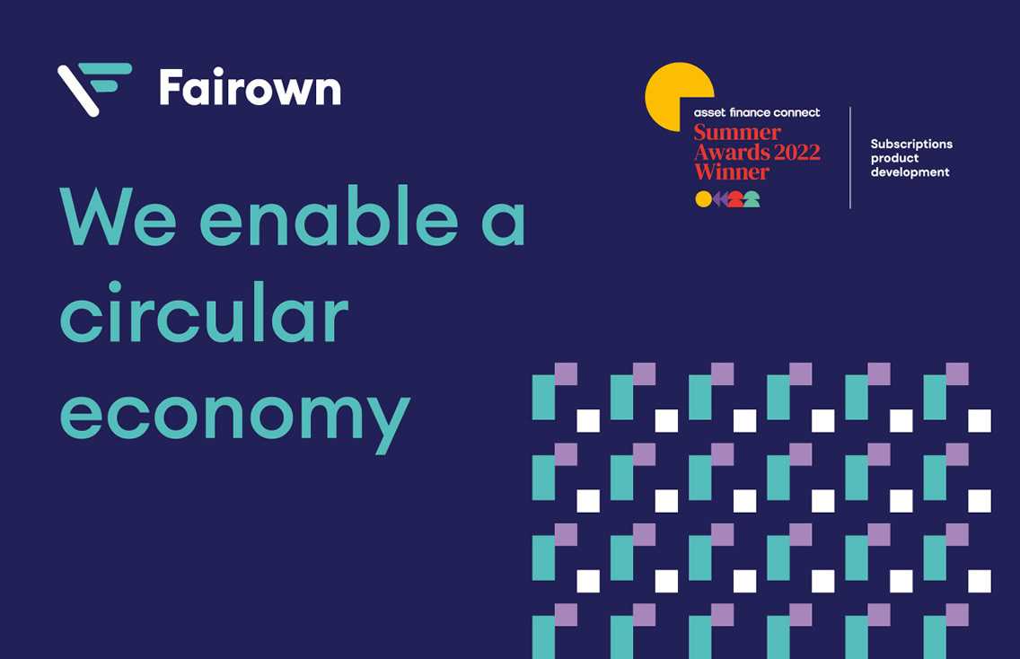
Marketing Materials and Web
Euclid Circular A
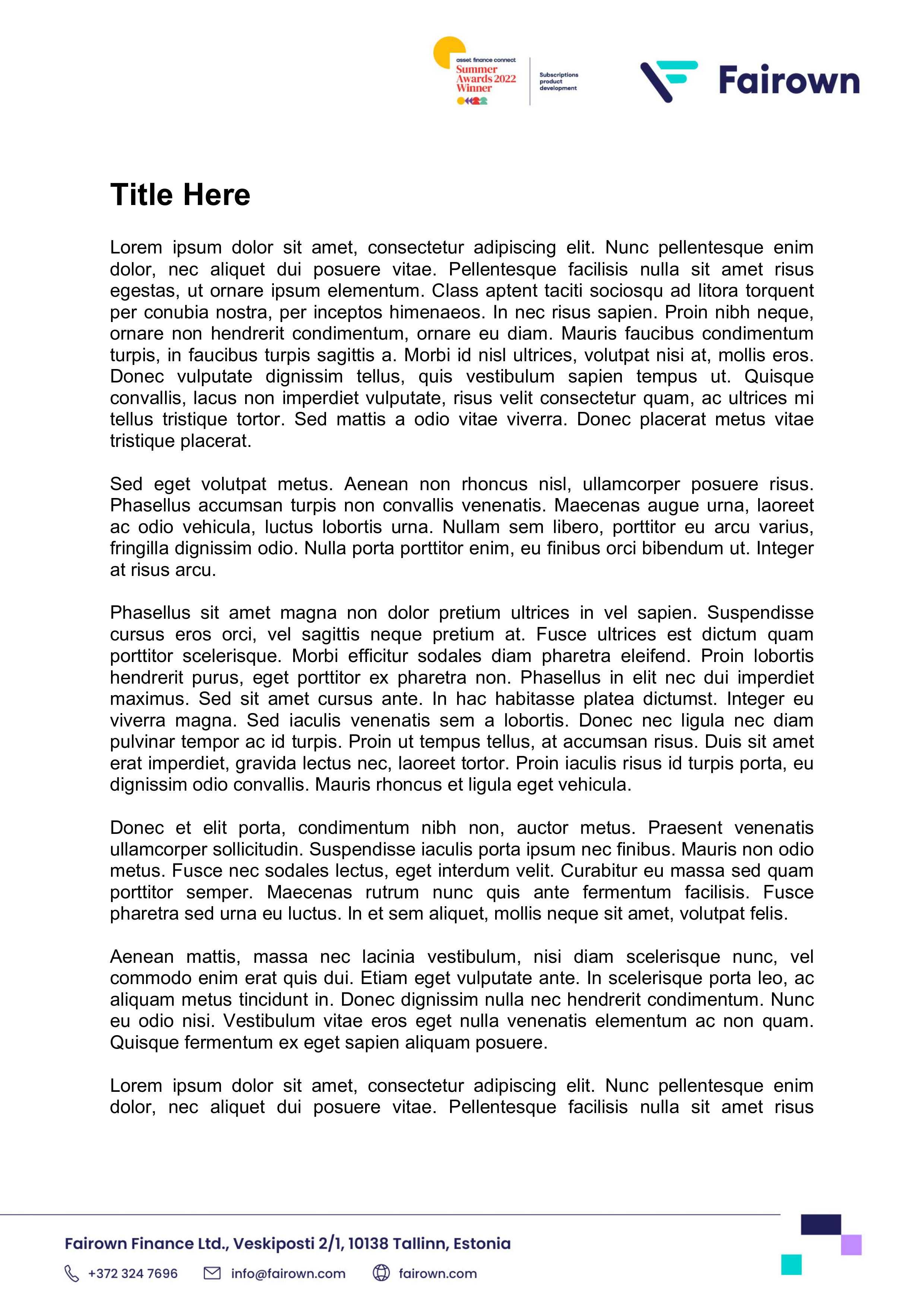
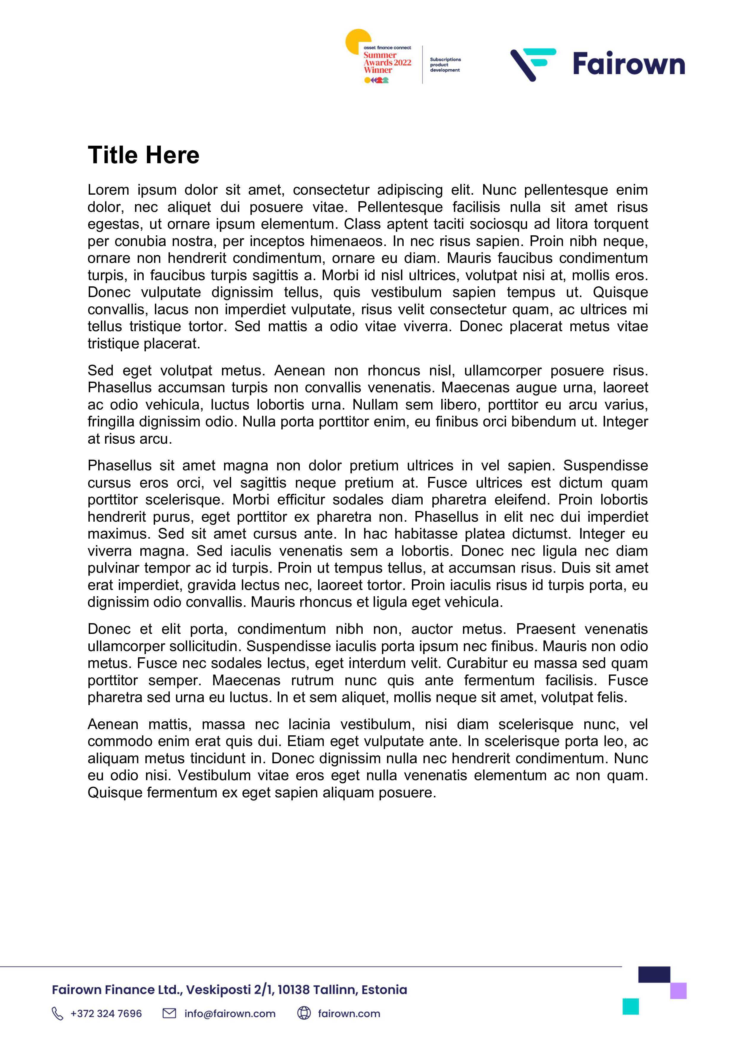
Corporate Documents
Arial
Presentation
Poppins
Euclid Font
Headline
Euclid Circular A Bold
Euclid Circular A SemiBold
Body Text
Euclid Circular A Regular
Euclid Circular A Light
Poppins Font
Headline 1:
Poppins Bold
Font Size 44 pt
Headline 2:
Poppins Bold
Font Size 28 pt
Body text:
Poppins Regular
Font Size 20 pt
Our tone of voice is friendly, open, rather informal. We prefer the first person (“I and we” instead of “it and they”) format when communicating to stakeholders - our employees, customers, partners, and the public.
We use British English in our communication.
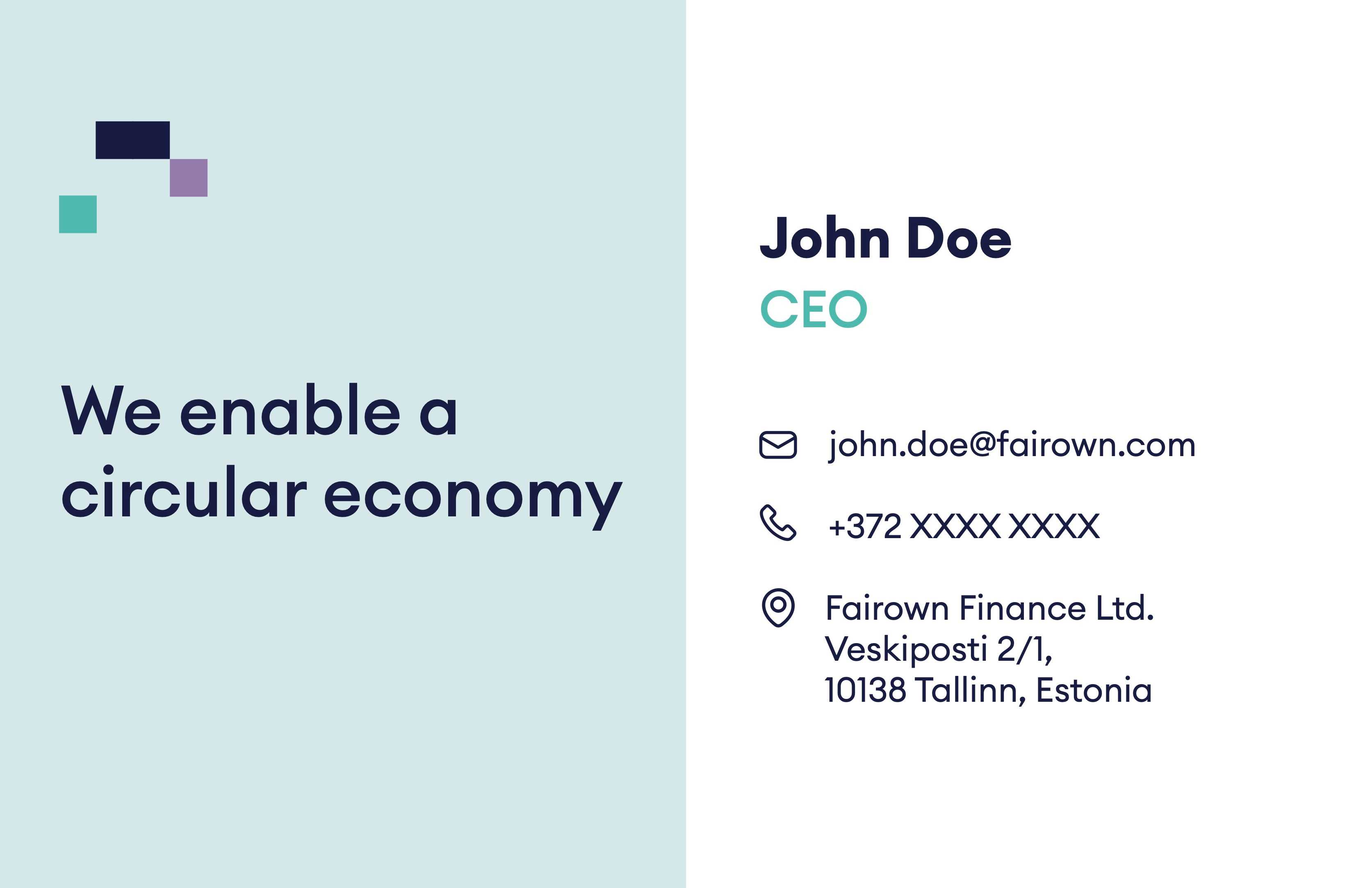
Print information:
- dimensions: 85 x 55 mm;
- digital print;
- paper: Nautilus Classic 300 g, uncoated.
How to set up the e-mail signature?
- Download the signature HTML file.
- Open the file in your browser.
- Select all the elements and copy them.
- Paste the elements to your e-mail client and replace the data with yours.
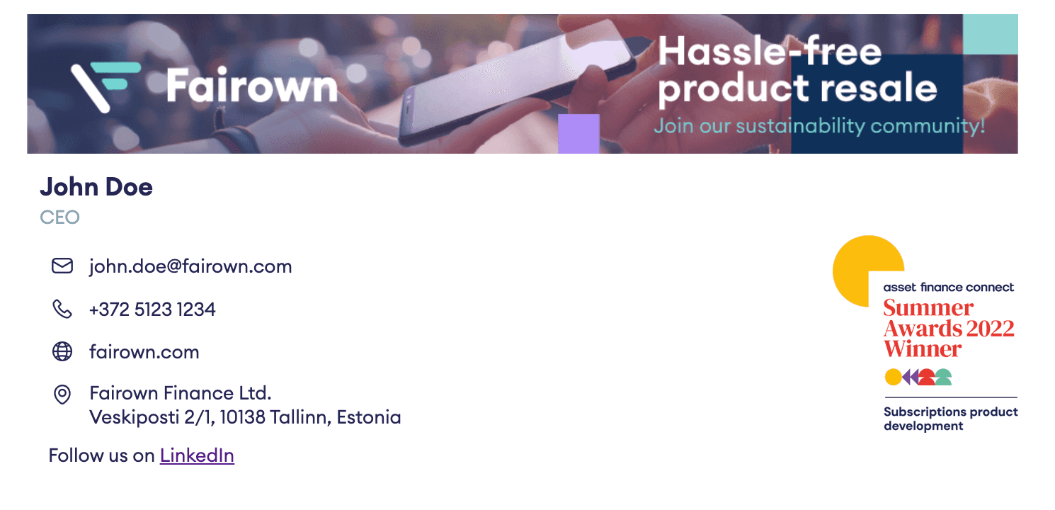
Use this signature in daily e-mail communication.
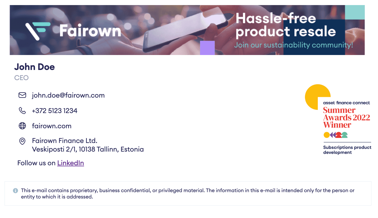
Use this signature in daily e-mail communication with a potential customer or partner if we don't have an NDA or cooperation agreement with them and your e-mail contains confidential information.
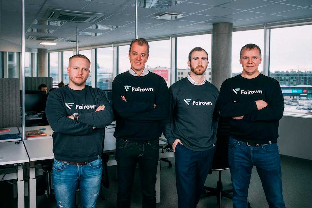
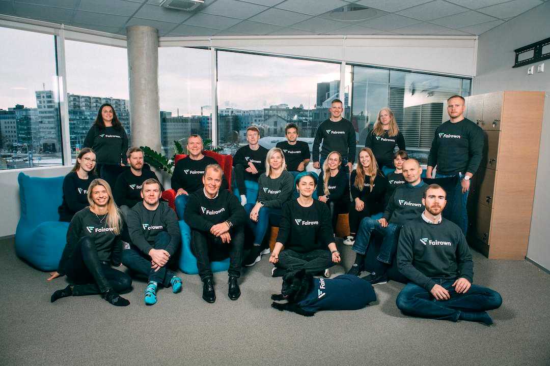
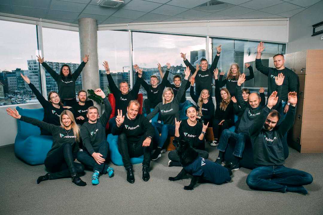
We use photos instead of animated characters in our branding. The style of photos is emotional, easy-going, warm, and caring as opposed to corporate. You can also use filters when presenting photos.
When choosing your photos, make sure they tick the following boxes:
- do the people in this photo look natural and unposed?
- does the picture show emotion?
- does the lighting look natural?


Solid Opacity
#262556
50%

Linear Gradient
#262556
100% → 0%
Here is another example of using colour filters when presenting pictures
And another filter
you can use.

Solid Opacity
#B58CFF
50%

Linear Gradient
#B58CFF
100% → 0%


Solid Opacity
#AF8CFF
50%

Linear Gradient
#AF8CFF
100% → 0%
Additional option to use purple colour
And another filter
you can use.

Solid Opacity
#E2EDF3
50%

Linear Gradient
#E2EDF3
100% → 0%

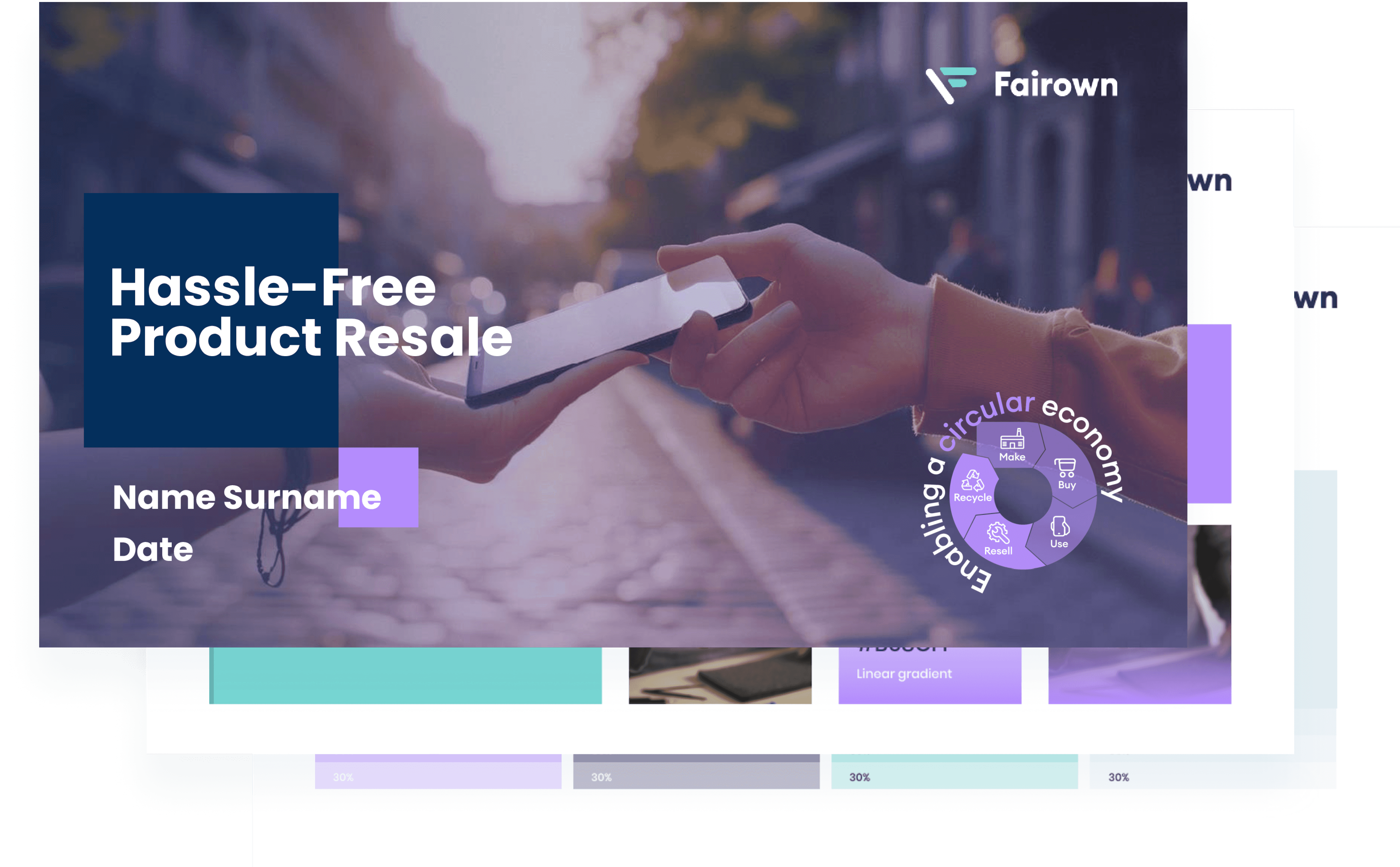












Social Media Templates